Kodak Portra
1998–presentThe portrait photographer's film — fine grain, natural flesh tones, soft pastels. Designed for skin.
C-41 process color negative film. Engineered for natural skin rendition. Low contrast, wide latitude.
American
Replaced Kodak Vericolor. Became the standard for professional portrait and wedding photography. Still in production.
Color negative film — wider latitude than transparencies. Designed around Caucasian and darker skin tones. Portra 400 is the most popular variant.
Portra flesh
Natural, accurate flesh tone — Portra's raison d'être.
Material: C-41 negative scanned, skin-optimized dyes
RGB(218, 184, 152)
Portra pastel blue
Soft, desaturated blue — Portra mutes colors for pleasing pastels.
Material: Cyan dye layer, low saturation
RGB(139, 170, 186)
Warm highlight
Warm, creamy highlights — never cold or clinical.
Material: Orange mask base + low-density dye layers
RGB(232, 216, 200)
Lifted shadow
Shadows are lifted, low-contrast — detail preserved in dark tones.
Material: High-density area, wide latitude design
RGB(77, 74, 72)
Portra green
Muted, gentle green — opposite of Velvia's hyper-saturation.
Material: Cyan + yellow dye layers, desaturated
RGB(90, 138, 90)
Golden hour warmth
Warm golden tones in late afternoon — Portra enhances this naturally.
Material: Yellow + magenta bias in warm light
RGB(202, 160, 96)
Related Materials
If this palette inspired you, here’s what to paint with.
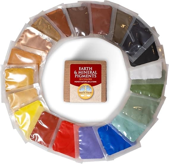 Natural Earth Paint Pigment Sample Pack, 20 Mineral PigmentsView on Amazon
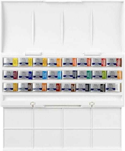 Winsor & Newton Cotman Watercolour Studio Set, 24 Whole PansView on Amazon
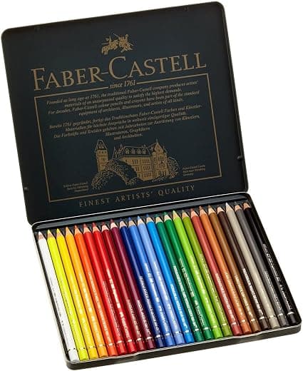 Faber-Castell Polychromos Artists’ Colour Pencils, Tin of 24View on Amazon
As an Amazon Associate, Pigmentoria earns from qualifying purchases. This page may contain affiliate links.